Coaching · Web Design & Development · 2026
Nicole Woldrich
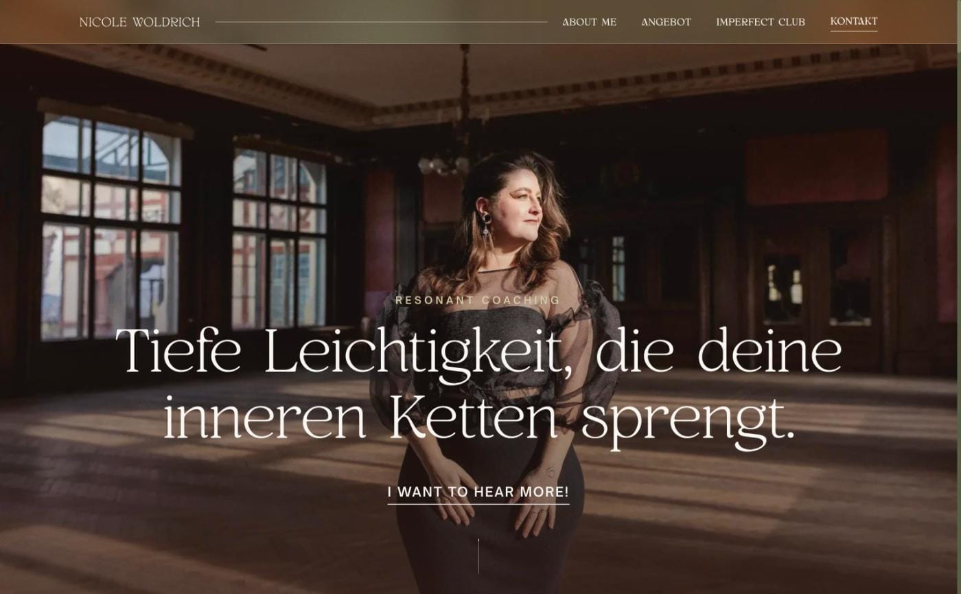
A coaching website that feels like a deep breath. Olive, cream, warm light and a serif that takes its time.
 www.nicolewoldrich.com
Embedded here is the real production site, live at www.nicolewoldrich.com.
The brief
Nicole coaches women who are tired of making themselves small. Her line on the hero says it better than I could: Tiefe Leichtigkeit, die deine inneren Ketten sprengt. The website had to carry that sentence. Soft enough that nobody feels pushed, confident enough that it doesn't read like another pastel wellness template.
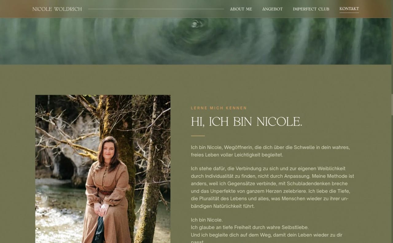
So the first decision was what to leave out. No stock smiles, no icons with leaves on them, no "book now" button chasing you down the page. Her photos are strong (a ballroom in late light, a forest river, fog), so the design steps back and lets them do the talking.
Slow on purpose
Most sites I build want to move. This one wants to breathe. The type is a high-contrast serif, set large and with generous leading, next to a quiet sans for reading. Sections fade in rather than fly in. The palette comes straight out of her photos: olive and deep olive for the surfaces, a warm cream for text, and one muted gold for the small labels that guide you through.
The design steps back and lets her photos and her words do the talking.
Between the sections runs a marquee of the words her clients come for: Weiblichkeit, Freiheit, Leichtigkeit, Selbstwert. It's the one element that's always moving, and it moves slowly.
An offer page that reads like a path
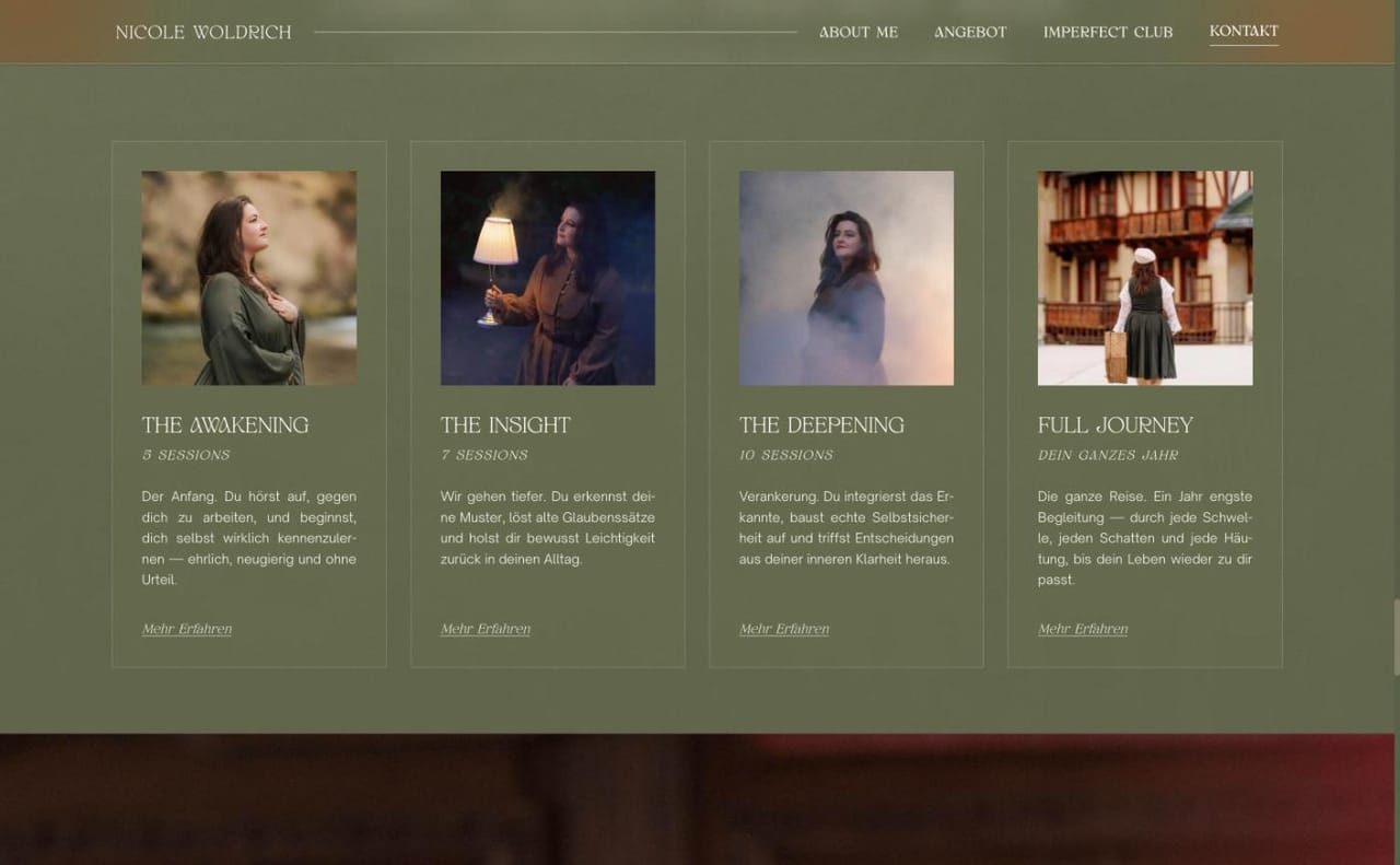
Coaching packages are usually a pricing table. Nicole's are stages of the same journey (The Awakening, The Insight, The Deepening, Full Journey), so the cards are written and laid out as steps you take, each with its own image and a single "Mehr erfahren". The next-steps block does the same for booking: choose a date, fill in a short questionnaire, talk. Three steps, no surprises.
Under the hood
It's a Next.js App Router site on Vercel. All imagery goes through next/image as WebP in several sizes, which matters on a site that is mostly large, atmospheric photos. The fonts are self-hosted, and the content is German first, because that's who she talks to.
It's one of those projects where the best compliment is that nobody notices the website. They just keep reading.
Colours
Design language
Olive
#6B7258
Deep olive
#4A5038
Cream
#F0EBE3
Gold
#C9A26A
Glimpses
From the project
Stack
Built with
- Next.js (App Router)
- React
- next/image (WebP)
- Vercel
Got a project that should feel just as special?